
How to Optimize Your E-commerce Website for Better User Experience
- Rob May

- Sep 12, 2023
- 14 min read
Updated: Sep 12, 2023

The Importance of UX in E-commerce
Imagine the following scenario:
You’ve decided to venture out on a shopping spree.
Your excitement bubbles as you approach your destination—a store that you've heard plenty about.
However, upon entering, your enthusiasm dampens. The aisles are a maze of confusion, dimly lit, and with items jumbled everywhere.
Worse yet, the staff seems aloof, more interested in their phones than assisting customers.
Most would agree that such a shopping experience is far from ideal.
This physical store analogy is strikingly similar to navigating an e-commerce site with a poor user experience (UX). That's why it's so important we have a design and UX process in place.

The digital realm has transformed how we shop, and a website's design and navigability have become the modern storefront.
When it's cluttered and confusing, customers are left bewildered, unsure where to go or what to click on next.
Online shopping isn’t just a transaction—it's a journey.
It starts from the instant a potential customer types your web address or clicks on a link leading to your site. The user experience is critical so take the time to get it right!
From that first point of contact to the final stages of checkout, every step should be designed to be intuitive, engaging, and enjoyable.
Consider the vast range of products available online.
While the quality and appeal of these products are vital, the manner in which they're presented—coupled with the ease of the buying process (UX)—can significantly influence a customer's decision to purchase.
Basically, an optimal UX experience doesn't just enhance the shopping experience; it amplifies the appeal of your products, making customers more inclined to finalize their purchases rather than abandoning their carts.

First Impressions: The Role of Web Design in Brand Perception
We've all been told at some point, "Don't judge a book by its cover."
It's a timeless adage that teaches us the importance of delving deeper, of not letting superficial appearances cloud our judgment.
But in the digital age of e-commerce, where split-second decisions are made as pages load and images appear, this saying takes on a slightly different meaning.
When a user lands on an e-commerce site, the initial visuals—the digital "cover" of the brand—become the primary point of judgment.
Within mere seconds, users gauge the trustworthiness, professionalism, and quality of a brand based on the design elements they encounter.
Take Billabong - the surf company (below):
The use of colors, the layout, navigation, the typography, and the imagery—all these components work together to create a cohesive brand story and a beautiful one at that!

When you are working on your own projects, reflect on your own experiences.
When you're greeted by a clean, modern, and well-structured website that’s easy to navigate, you immediately feel more confident about the brand's legitimacy and the quality of its products or services.
It mirrors the feeling of entering a physical store that's orderly, bright, and inviting, with products displayed attractively and salespeople ready to assist.
Contrast this with a site that's cluttered, has mismatched colors, and feels outdated. Just as you might be skeptical of a physical store with broken signage, poor images, dim lighting, poor contrasts and disorganized shelves.
A poorly designed website raises red flags about the brand's credibility and the quality of its offerings.
Take Yale's School of Art website example (below). It's astonishing to think we're listing this site among the least impressive websites globally. It blew us away how cluttered and unorganized it felt! Were it solely based on their online presence (Yale!), the school wouldn't enjoy its current reputation.
The backdrop, color palette, content layout, and cumbersome navigation feel far removed from contemporary standards. It's very clunky and hard to follow.
Though the site is optimized for mobile (we can't believe this part!), on a user level - the UX (user-experience) leaves much to be desired.

Today, where competition is fierce, and customers have a plethora of options at their fingertips, the power of first impressions cannot be overstated.
A well-designed website doesn't just make your products look good—it fosters trust.
And in e-commerce, trust is the cornerstone that can pave the way to customer loyalty and increased sales.
Image Optimization: Bringing Products to Life Digitally
Imagine walking into a brick-and-mortar store: the tactile sensation of fabric beneath your fingers, the gleam of jewelry under the store lights, or the detailed design on a ceramic vase.
These sensory experiences are an integral part of physical shopping, offering assurance about product quality. But how do you recreate such tangible interactions in the digital realm?
Enter the world of image optimization, where the visual portrayal of products becomes paramount.
Images are the ambassadors of your products.

The closest thing to touching or feeling a product online is viewing it in sharp detail.
A blurry or poorly lit photograph not only diminishes the perceived quality of the item but also hampers the trust customers place in the brand. It's about the same as showcasing merchandise in a dim, dusty corner of a physical store.
Take Burton.com for example. They do an AMAZING job with their e-commerce product photography (and is hands down something that makes me an avid buyer of their products for the last 35 years!). Cinematic, in their elements, lots of contrast and great lighting and clarity. Perfect!

ProTip: You cannot skimp on this step of the process. Taking the time to create a photo gallery of the - other competitors are getting more and more savvy each day with their e-commerce stores!!

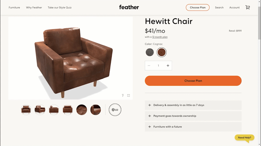
Further enhancing this visual experience are 360-degree views and videos, giving potential buyers the most holistic view possible.
Suddenly, seeing the intricate stitching on a chair or the subtle texture of a leather becomes palpable (like the 3d view below), allowing shoppers to engage with products on a deeper level.
Research has shown that the quality of product images directly influences purchasing decisions. Why? Because consumers want certainty.
They want to know that the teal-coloured dress they're eyeing is indeed the shade they desire, or that the sleek watch they're considering buying has the exact features they're after.
In essence, top-notch imagery bridges the sensory gap between online and offline shopping.
It's not merely about aesthetic appeal; it's about fostering trust, reducing returns, and ensuring customer satisfaction (take that last one to the bank!).
Listening to Your Users' Feedback
In the ever-evolving landscape of e-commerce, there's one resource that's often undervalued yet holds immense potential: customer feedback.
These aren't just comments or casual remarks.
Instead, think of them as nuggets of gold, offering insights straight from those navigating and experiencing your platform firsthand.
Your brand's website mirrors your core values.
Given its significance, it's essential to encourage visitors to buy your products. A popular method to showcase UGC (User Generated Content) reviews on your site is through embedding.
Whether on the homepage, service or product pages, header in the page design, footer or as a sidebar widget, embedding these reviews is straightforward fro customers and builds both trust and confidence. Most plugins for various CMS systems have these features available.

The value of feedback is twofold.
Firstly, it provides e-commerce businesses with a real-time critique, highlighting areas of excellence and pinpointing aspects that need enhancement.
No amount of internal testing can replace the candid, unfiltered voice of the customer.
Whether it's the ease of the checkout process, the clarity of product descriptions, or the speed of page loading, customers offer a ground-level perspective that's indispensable.
Secondly, by integrating feedback mechanisms, businesses send a powerful message: "We value you."
By giving customers platforms to voice their experiences—be it through comment sections, interactive surveys, or innovative QR code-driven feedback forms—brands foster a sense of community and engagement.
This active solicitation of opinions, followed by visible efforts to act on the feedback, transforms casual shoppers into brand ambassadors.
It's akin to a store manager proactively approaching customers, not just to sell, but to understand and improve.
And with the rise of technology, capturing feedback has become more dynamic than ever. Interactive polls on social media, AI-driven chatbots that solicit comments post-purchase, or even gamified surveys that offer rewards for participation, can all contribute to a richer tapestry of user feedback.
But keep in mind, soliciting feedback is just one part of the equation.
The true magic lies in how brands respond and evolve based on this input.
In the grand theatre of e-commerce, feedback isn't just a one-off act; it's a continuous dialogue, underscoring a brand's commitment to excellence and its unwavering focus on customer-centricity.
Setting Right Expectations with Accurate Product Info
Ah, the joys of online shopping—browsing through endless options, savoring the thrill of a good deal, and the anticipation of awaiting a package. But there's a flip side.
The disappointment when the received product doesn’t match the expectation.
Remember the dress that looked royal blue on screen but arrived a muted navy? Or the "large" backpack that could barely fit a notebook?
Such discrepancies stem from one core issue: inaccurate product information.
A newer issue on the rise with e-commerce is the use of the term "organic" among products.
Legally, only products with the appropriate certifications and seal can be labeled as organic. However, numerous online products misuse "organic" as a primary descriptor such as this Moonlight Slumber product with Amazon. This item at Amazon is labeled as organic (in the product title), but it’s not.
Be sure to look for proper seals and definitions when writing names and descriptions.

Online shopping denies users the tactile experience of physical stores. In its absence, customers heavily rely on product descriptions to guide their purchases.
Herein lies the responsibility of e-commerce platforms: to paint a true, detailed, and comprehensive picture of each product.
Let’s go deeper:
Size and Dimensions
Be it clothing, electronics, or furniture, precise measurements are critical. For fashion, providing a size chart with measurements can make a huge difference. Similarly, for products that occupy space, like a couch or a lamp, exact dimensions can help customers ascertain if it fits their setting.
Color and Texture
Photographs can sometimes be deceptive, given differences in screen calibrations. It’s crucial to detail the specific shade or finish of a product. Describing a shirt as 'midnight blue' or a sofa as 'velvety matte finish' can offer more clarity.
Materials and Components
What's it made of? This isn’t mere curiosity; it often determines purchase decisions. Someone might be allergic to a specific metal, another might prefer sustainable materials. Providing a breakdown of components ensures informed choices.
Care Instructions
This often-overlooked piece of information can be a game-changer. From washing instructions for apparel to maintenance tips for gadgets, such guidance not only assists consumers post-purchase but also showcases a brand's comprehensive approach.
Reviews and Q&A
Encouraging reviews and hosting a Q&A section allows potential buyers to gauge real-life experiences of peers and get answers to specific queries.
Now, maintaining such a site with consistent accuracy across hundreds or thousands (or even hundreds of thousands of products) might sound daunting. Just saying it to myself it does, only because I know the amount of work needed to be successful!
But, this is where Product Information Management (PIM) systems enter the scene!
Think of PIM as the vigilant gatekeeper of an e-commerce platform, ensuring that every detail, every specification, and every description is spot-on.

It centralizes data, ensuring that product descriptions remain consistent across various channels, be it the main website, affiliate platforms, or mobile apps.
Setting the right expectations isn’t merely about avoiding short-term dissatisfaction. It’s about building trust for your brand.
It’s about cementing a relationship where customers know that what they see is what they’ll get. It’s about fostering loyalty.
Because a customer who trusts is not just buying a product; they're buying into a brand promise. And a brand that delivers on its promise every single time?
Well, that's gold in the world of e-commerce.
Make Navigation & Product Discovery Effortless
Ever tried finding a book in a messy library? Almost impossible. It's an exercise in patience and often ends in frustration.
Similar feelings arise when a visitor lands on an e-commerce website that lacks clarity and organization.
Just as you'd struggle to find a book among disorganized and cluttered shelves, online shoppers can feel overwhelmed and lost when faced with confusing website structures.
This isn't just about aesthetics; it's about ensuring users can easily find what they're looking for.
Now, consider the digital titans of the shopping world: Walmart and Amazon. They offer a masterclass in the art of navigation.
Imagine the enormous inventory they manage; yet, when you visit their sites, the experience is fluid, logical, and even intuitive.
They achieve this through thoughtfully designed navigation.
Drop-down menus are clear, concise, and logically grouped.
Now, there are a lot of sites today that are setting themselves up for success.
Search functions are advanced yet simple, using auto-suggestions and filtering options to guide users as PRFO.com like the one below.
A well crafted site navigation and architecture setup is the ultimate experience for both users and search engines!

Category listings are straightforward, helping visitors drill down to their desired product range without unnecessary clicks - creating the ultimate user experience!

This is not just a matter of convenience. It directly impacts a business's bottom line. A visitor who can't find what they're after is a visitor who's likely to leave.
Simplified navigation doesn't mean dumbing things down. It just means creating a roadmap that guides users, making their journey not only easier but more enjoyable.
As businesses design or revamp their online presence, they should ask: if my website were a physical space, would shoppers enjoy exploring it?
Dynamic Page Design to Help Identification and Retention
Visual monotony is a reader's nightmare.
Just as you'd tire of reading a book where every page, sentence, and word felt repetitive, website visitors quickly disengage from static and monotonous page designs.
Dynamic page design, on the other hand, is like a well-written novel, where each chapter offers something new, holding the reader's interest till the very end.
We're all undoubtedly acquainted with TED. Their uplifting and motivational discussions inspire personal growth.
The website's minimalist design enhances its appeal, and its user-friendly navigation encourages prolonged browsing. Kudos to them!
Takeaways from this exemplary website design:
Uplifting and motivational content
A catchy tagline
Recognized web presence

What does dynamic really mean in the context of website design?
It's a blend of diverse content blocks, tailored to keep users engaged.

Catchy and concise text might introduce a section, followed by vibrant images that add a splash of colour and context.
Throw in an interactive video or an infographic, and you've got a digital tapestry that's both informative and engaging.
But here's where the real magic happens: contrast.
The art and science of design hinge on effectively using contrast to guide the viewer's eye and maintain their interest.
This can be achieved in various ways – juxtaposing bold fonts with lighter ones, using contrasting color schemes for background and content, or alternating between text-heavy sections and image-led spaces.
This isn’t just about looking pretty; it's grounded in psychology.
The human eye is attracted to variety and change, and the brain is more likely to retain information presented in diverse formats.
To drill the point in, dynamic design is all about storytelling. Each section of a website should unfold like a chapter in a book, guiding the visitor on a journey, making sure they're engaged every step of the way.
Whether it's an e-commerce platform selling products or a blog sharing information, the goal remains the same: Captivate, inform, and inspire.
Streamlined Conversion Paths: Guiding Users to Purchase
Imagine you're on a guided tour. You're exploring a fascinating new place, taking in the sights, and thoroughly enjoying the journey.
Suddenly, your guide stops, leaving you stranded in an unfamiliar area, unsure of which way to turn. Frustrating, right?
This analogy can be likened to a user's journey on an online store. They've perused your site, found something they love, and are ready to make it theirs.
But if the path to purchase isn't clear and effortless, they may just leave, never to return.

Here's where the art and science of streamlined conversion paths come into play. A few strategies to ensure a smooth ride:
Color Psychology: Did you know that colors can influence our actions and decisions? That's why the colors chosen for key website elements, especially call-to-action buttons, matter.
Red often evokes excitement and passion.
Blue symbolizes trust and dependability.
Green is associated with growth and positivity.
Orange can be a call to action, exuding enthusiasm and excitement.
Picking the right shade can indeed be the nudge a potential customer needs.
Personalized Recommendations: Ever felt the joy of a friend recommending a book or movie that you ended up loving?
That’s what personalized shopping suggestions aim to emulate.
By analyzing user behaviour, previous purchases, and browsing patterns, AI-powered tools can offer product recommendations that feel tailor-made for the shopper. It's like having a shopping assistant who knows your tastes perfectly.
Seamless Checkout Experience: Reducing Cart Abandonment
Let's assume a user has filled their virtual shopping cart, which is an obvious sign of intent and interest.
But then, a long checkout process, confusing options, or any security concerns can easily make them abandon ship.

The process of moving from interest to purchase should feel like gliding on a smooth surface, not trudging through a rocky terrain.
Key factors to optimize the checkout process:
Minimal Steps: The fewer the steps, the better. Each additional click or page load can be a potential drop-off point.
Transparent Pricing: No surprise fees or hidden charges. Everything should be clear from the get-go.
Security: The assurance that personal and financial data is safe is paramount. Highlighting security certifications or using trusted payment gateways can enhance this trust.
Easy Edit Options: Let users easily modify their cart, be it changing quantities or removing items, without having to navigate away from the checkout page.
Building Long-Term Customer Relations
While this leans more towards operational decision-making, it's important to include as it will help the overall user experience with your business, not just your website.
After all, businesses aren't just built on products or services - they're built on trust.
Here's a simple way to understand it:
Clear Communication: Whether it's product details, shipping costs, or return policies, clarity is key. No one likes nasty surprises, especially not when they're about to part with their money.
Openness in Interactions: This means readily available customer service, prompt responses to queries, and addressing concerns head-on.
Transparent Operations: This can range from sharing about sourcing practices (if relevant) to openly discussing any challenges or issues the business might be facing.
Building Relationships: Offering loyalty programs, remembering customer preferences, and personalized communication can go a long way in ensuring customers don't just buy once, but turn into loyal patrons.
In a world teeming with options, trust is the glue that binds customers to brands.
Transparent practices, combined with genuine care for the customer's needs, lay the foundation for fruitful, long-lasting relationships.
Providing Real-Time Support with Chatbots, AI & Content
Remember the days when you'd walk into a store and a helpful assistant would approach you, ready to answer questions or provide recommendations?
Yeah, sure you'd get the occasional aggressive sales person working commission, but that level of personalized attention often made shopping more enjoyable and efficient.
Online shopping, while convenient, can sometimes feel like navigating an ocean without a compass. This is where online assistance shines.
In fact, when it comes to customer retention, chatbots prove to be invaluable. Tommy Hilfiger's Messenger chatbot, by offering a tailored experience, achieved an impressive 87% rate of repeat customers.

The role of online assistance in e-commerce is monumental and can no longer be ignored!
Think of the countless times you've had a question about a product's specifications, shipping details, or warranty information.
Waiting hours or even days for a response can be off-putting.
Real-time support, in contrast, is akin to having a friendly assistant by your side, guiding you through the maze of options and addressing concerns immediately.
E-commerce chatbots are on the rise in the online shopping realm.
Why? Shifts in customer tastes are the reason. Messaging is now more prevalent than ever, with leading messaging applications boasting more monthly users than even social media platforms.

Image source: Apruve
Here are some of the tools and methods that are making waves:
Chatbots and AI: Imagine having a query at 2 am and getting an instant response. Chatbots, powered by Artificial Intelligence, are available around the clock, providing immediate answers and solutions. They're like the ever-energetic store assistants who never tire and are always informed.
Resourceful Content: While instant chat support is invaluable, there's also a place for in-depth assistance. Blogs can dive deep into product uses and benefits, how-to videos can demonstrate product assembly or usage, and social media updates can offer insights into new arrivals, user testimonials, and more.
These resources are akin to the detailed product manuals or workshops that brick-and-mortar stores might offer.
The Correlation Between User Experience and Business Growth
As we wrap up this exploration into the world of e-commerce, let's take a moment to reflect.
Digital shopping isn't merely about transactions; it's about experiences.
Every detail, from the layout of a webpage to the speed of checkout, contributes to this experience.
User Experience, often abbreviated as UX, stands at the crossroads of customer satisfaction and business success.
Here's an analogy: consider UX as the atmosphere of a store. Just as a well-lit, neatly organized, and welcoming physical store draws customers in, a well-designed website with intuitive navigation and prompt support does the same online
But why is this important for businesses?
The answer lies in the numbers and the narratives.
Happy customers don't just make a one-time purchase. They return, they explore, they recommend, and they advocate.
They boost sales, elevate brand reputation, and even influence the perceptions of potential customers. In essence, superior UX creates ambassadors out of ordinary buyers.
But the magic of e-commerce is its ever-evolving nature. Technologies advance, consumer preferences shift, and market dynamics change.
Amidst this flux, one constant remains: the quest for a better user experience.
It's a journey with no final destination, as there's always a new horizon to explore, a new innovation to implement, and a new standard to set.
The road ahead is paved with possibilities, promising a fusion of ecstatic customers and flourishing businesses.
The future of e-commerce, illuminated by the beacon of user experience, indeed looks bright!
Ready to elevate your e-commerce site's user experience? Don't let potential sales slip through due to a less-than-optimal interface.

Take action now and implement the strategies discussed to ensure your customers enjoy a seamless shopping journey.
Start optimizing today and watch your conversion rates soar!
Need assistance? Reach out to our experts for a tailored solution.


Comments